(Münster’s map of the Americas, 1550. Click to embiggen)
I’ve always found maps fascinating. As a young child I spent hours studying atlases, memorizing capitol cities, admiring coastal curves, and wondering whether the great continental jigsaw puzzle is evidence of some divine plan (no, it isn’t). Historical atlases were even better, marking with colourful arrows the movements of peoples and the advancements of armies as empires coalesced and, inevitably, disintegrated.
As systems of relational representation, maps can be very useful to anchor dialogue on things like urban planning, climate change or sustainability. They provide members of the community a platform from which to start considering the effects of different processes on the natural and built environment, providing an analytic perspective that may help neutralize the effects of NIMBYism – allowing people to “think like a city”. Of course maps also pose a problem, in this respect, as they ask their viewers to leave their everyday experience behind and adopt instead a “view from nowhere” – a pseudo-neutral perspective that glosses over the fact that we all experience the terrain itself in very different ways. Cyclists experience the city quite differently from drivers or pedestrians, and thus hold a very different mental representation of it. (The ontological equivalent of this gap is what I think Whitehead meant when he talked about the bifurcation of nature).
Maps become even more interesting when they communicate non-spatial elements or aspects of reality that are otherwise invisible to our everyday perspective. Napoleon, tells James Burke in his Connections, established an eudiometry company in an effort to produce a “bad smell map” of Egypt in order to protect his men against malaria (literally “bad air” in Italian). I don’t know if that map was ever produced but if it was, I would love to see it. [update]
Bruno Latour talks about drawing cosmograms as a way to get at the real domain of politics – “the building of the cosmos in which everyone lives, the progressive composition of the common world” (Politics of Nature, 2004). Cosmograms, in this sense, may help us overcome our tendency to equivocate existence with being, substituting positionality with relationality. The world is not there to be discovered but is something we construct together, in practice.
(Map designed with Mapbox, from Atlantic Cities. Click to embiggen)
The evolution of maps seems to follow Latour’s logic. With the rise of “big data” it becomes possible to overlay a map’s more standard geo-spatial representation with dynamic elements drawn from a variety of sources, including social media or crowdsourcing (Layar does this with a pretty nifty app). We are literally co-making the world as we represent it cartographically. Several interesting examples can be found in Atlantic Cities’ year-end issue, where the magazine lists 10 fascinating innovations in mapping. Some of these are especially interesting for the ways that they translate data to something that can be experienced with more salience. Take for example the time lapse map from Google Earth (here’s Fort McMurray’s growth. Zoom out a little to see the tar sands in all their glorious ugliness).
No matter how sophisticated a map is – how many layers of dynamic information it includes, how granular its representation, how high its resolution – maps cannot escape the paradox of indexicality. As is often the case, J.L. Borges describes it the best (in his wonderful On Exactitude in Science):
…In that Empire, the Art of Cartography attained such Perfection that the map of a single Province occupied the entirety of a City, and the map of the Empire, the entirety of a Province. In time, those Unconscionable Maps no longer satisfied, and the Cartographers Guilds struck a Map of the Empire whose size was that of the Empire, and which coincided point for point with it. The following Generations, who were not so fond of the Study of Cartography as their Forebears had been, saw that that vast Map was Useless, and not without some Pitilessness was it, that they delivered it up to the Inclemencies of Sun and Winters. In the Deserts of the West, still today, there are Tattered Ruins of that Map, inhabited by Animals and Beggars; in all the Land there is no other Relic of the Disciplines of Geography.
—Suarez Miranda,Viajes de varones prudentes, Libro IV,Cap. XLV, Lerida, 1658
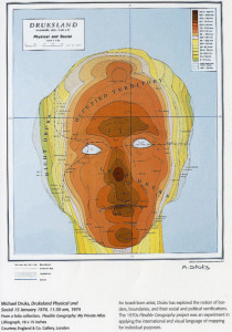
One exception to the paradox of indexicality, perhaps, are maps in which the cartographic vernacular is used to illustrate something that is entirely devoid of geo-spatial properties. Take for instance Druksland, by Israeli-born artist Michael Druks (it also adorns the cover of the Hebrew translation of Michel Houellebecq’s highly recommended The Map and the Territory).

(Michael Druks, Druksland, 1974. Click to embiggen)
If you dig these sorts of mental maps, check out the new box set Where You Are: A book of maps that would leave you completely lost. I can’t wait for my copy to arrive.

